Analytics Dashboard
The Analytics Dashboard is your central hub for monitoring chatbot performance, user engagement, and agent efficiency. This page helps you track key metrics, visualize usage trends, and gain actionable insights into how your bots and agents are performing.
To access this page, navigate to Analytics in the main sidebar.
Global Filters
At the top right of the dashboard, you can filter the data displayed across all tabs:
- Date Range: Select a specific time period (e.g., Last 7 days, Last 30 days) to view historical data.
- Filters: Use the filter button to apply specific criteria to your data views.
Basic Analytics
The Basic tab is your “Command Center.” It provides a high-level health check of your entire chatbot ecosystem. This is the first page you should check to answer the question: “Is my traffic growing and are my bots working?”
1. Core Performance Metrics (KPIs)
At the very top of the dashboard, you will see four key cards that summarize your total volume.
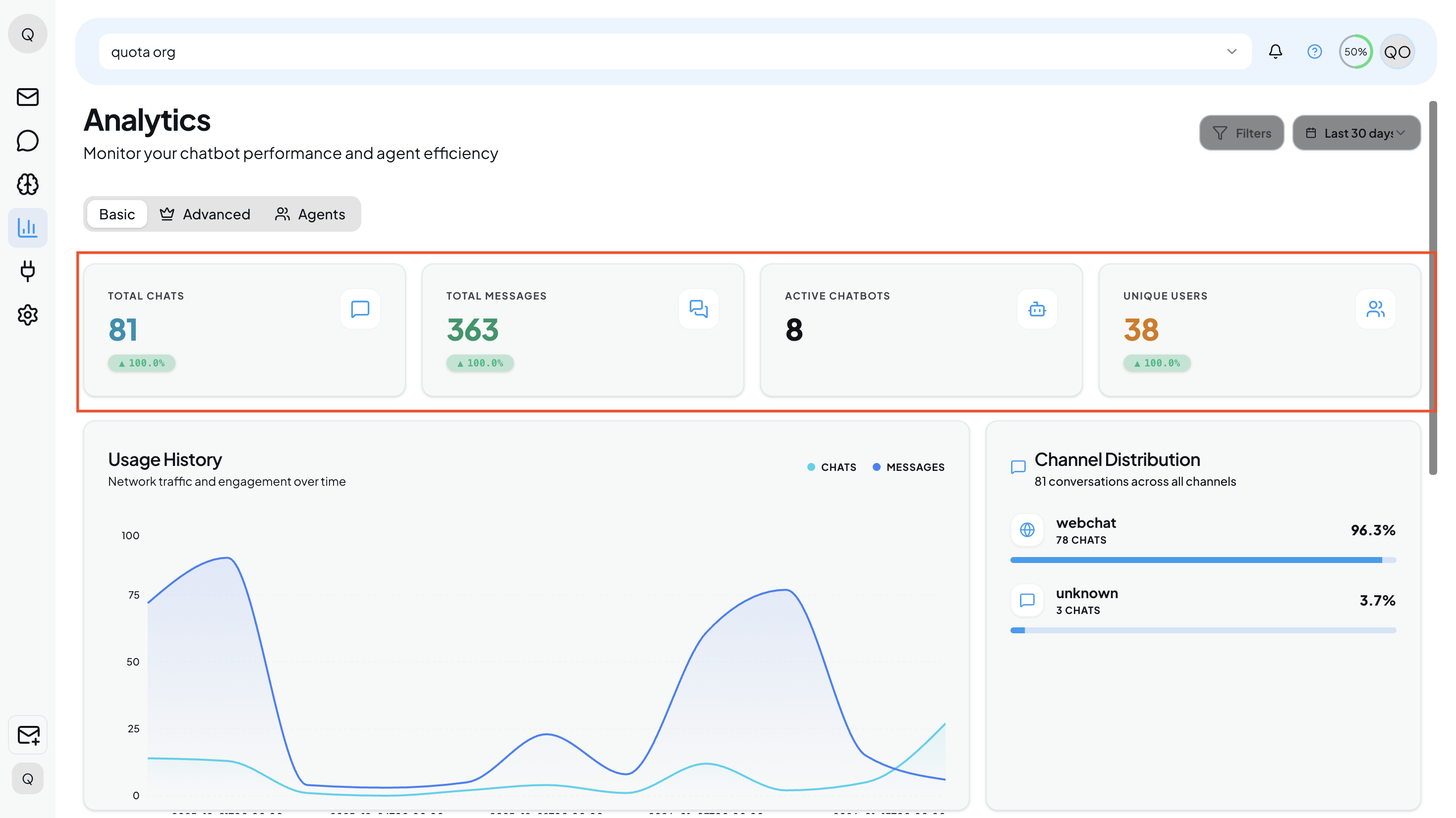
- Total Chats: The total count of separate conversation sessions initiated by users.
- Total Messages: The aggregate number of individual bubbles/messages exchanged across those chats.
Note: A high ratio of Messages to Chats often indicates deeper, more engaged conversations.
- Active Chatbots: The number of bots currently deployed and running on your site.
- Unique Users: The specific number of individual people interacting with your bots (filtering out repeat visitors).
Understanding Trends: You will notice green percentage tags (e.g., ▲ 100.0%) inside these cards. These indicators show growth compared to the previous period (based on the date filter you selected at the top right).
2. Traffic & Engagement
Directly below the KPIs, the Usage History graph helps you visualize traffic patterns.
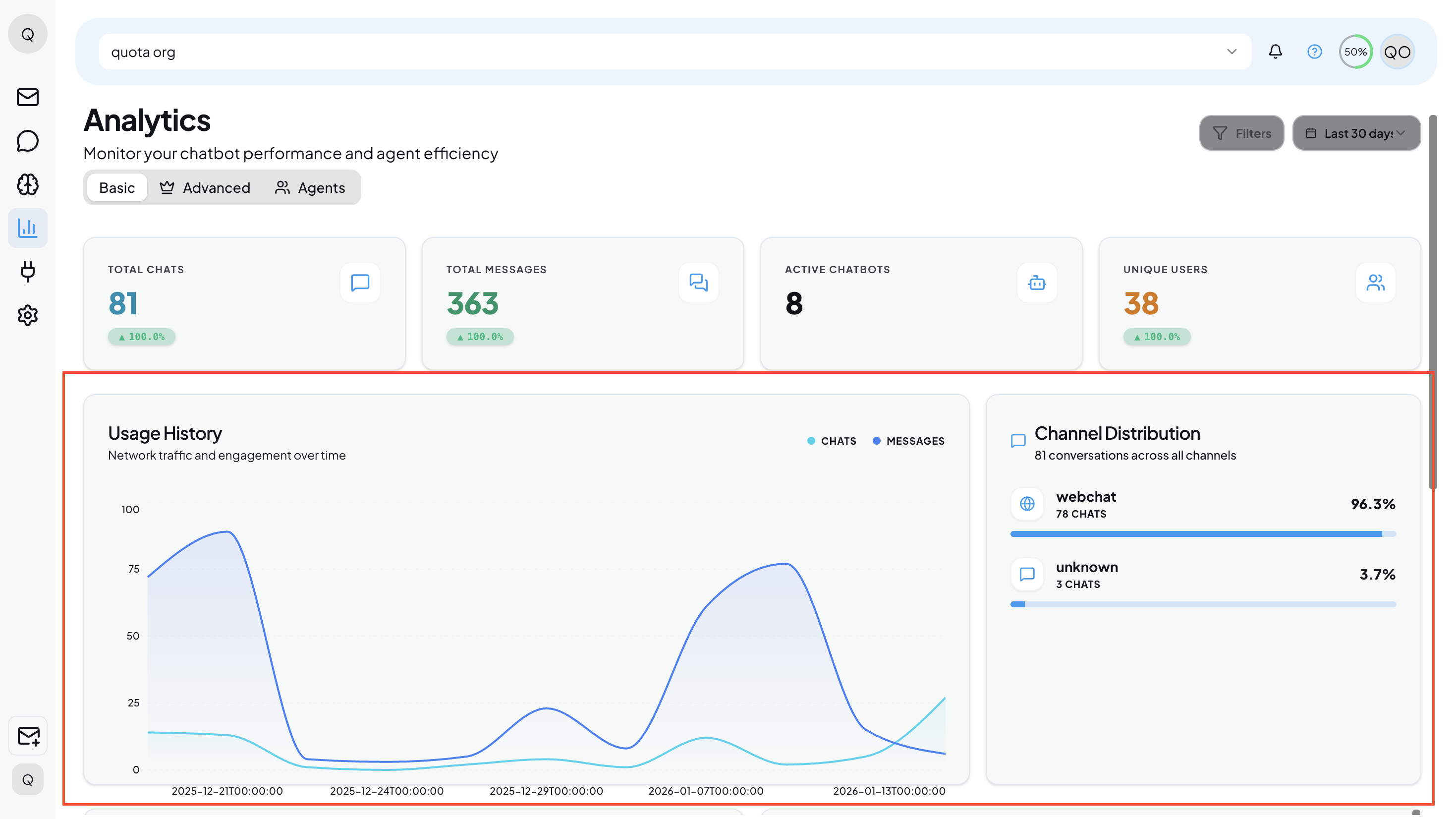
Usage History Graph: This dual-line chart plots Chats (light blue) against Messages (dark blue) over time.
Pro Tip: Hover your mouse over any specific peak or valley on the graph to see the exact date and volume for that moment. This is useful for correlating traffic spikes with marketing campaigns or specific events.
Channel Distribution: Located on the right side, this widget breaks down where your users are coming from. It lists the platform (e.g., Webchat, WhatsApp, etc.) and the percentage of total traffic it represents (e.g., 96.3%). Use this to decide which channels deserve more of your attention.
3. System Health & Recent Activity
Scroll down to the bottom half of the Basic tab to monitor technical health and real-time logs.
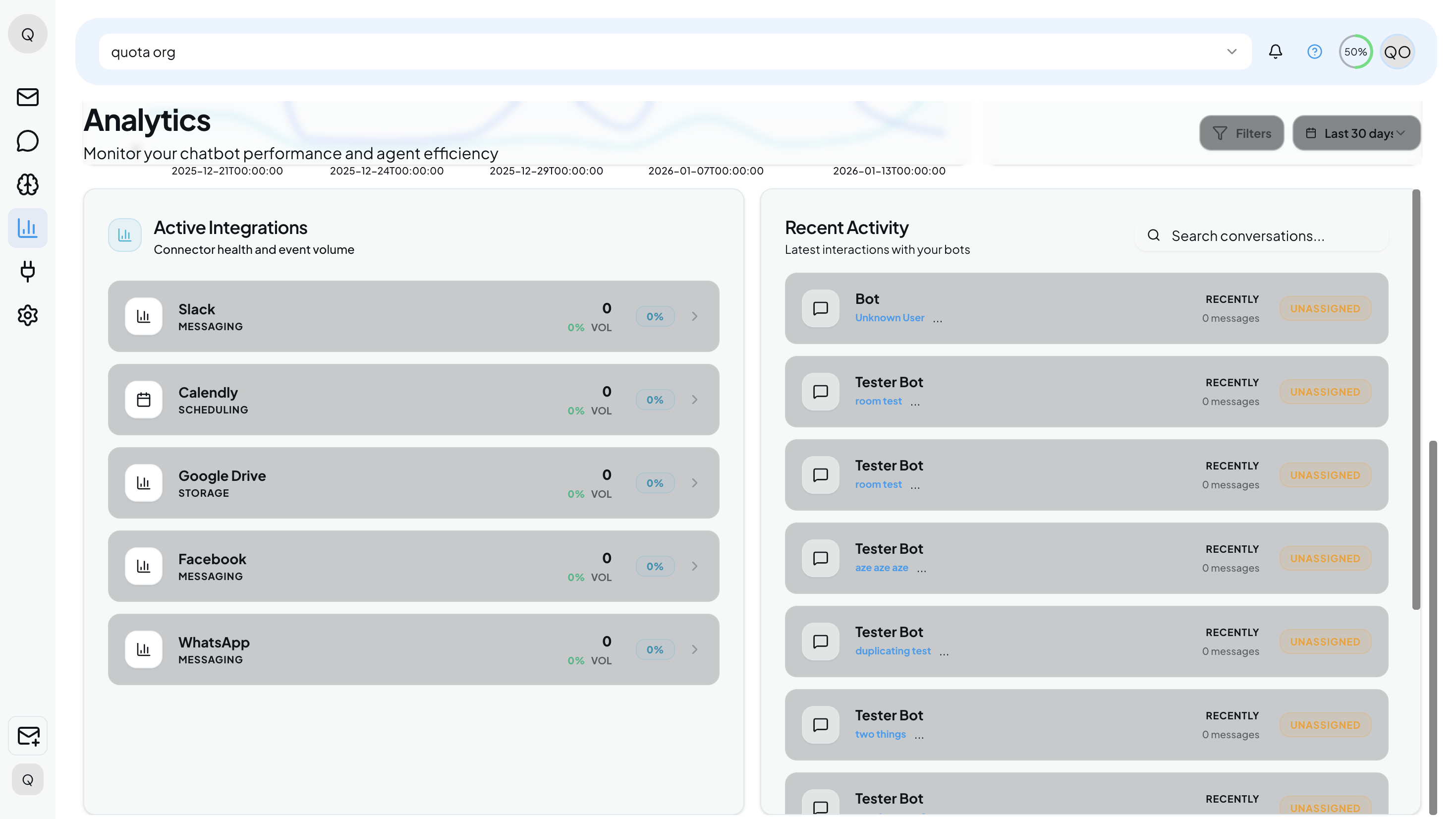
Active Integrations: This list displays the connection status of your third-party tools (like Slack, Calendly, Google Drive, Facebook, etc.).
- Health Check: It shows the volume of events flowing through each connector (e.g., 0% Vol), helping you quickly spot if an integration has stopped working.
Recent Activity: A live feed of the latest conversations happening right now.
- Bot Name: Identifies which bot is handling the chat (e.g., Tester Bot).
- Status Tag: Look for tags like Unassigned to see chats that haven’t been picked up by a specific human agent yet.
- Message Preview: Shows a snippet of the last message sent, giving you immediate context on user intent.
Advanced Analytics
The Advanced tab is your optimization engine. While the Basic tab tells you how much traffic you have, this tab tells you how well you are handling it. Use this page to improve conversation quality, reduce human workload, and refine your bot’s logic.
1. Quality & Efficiency Metrics
At the top of the page, you will find four critical metrics that define the quality of your user interactions.
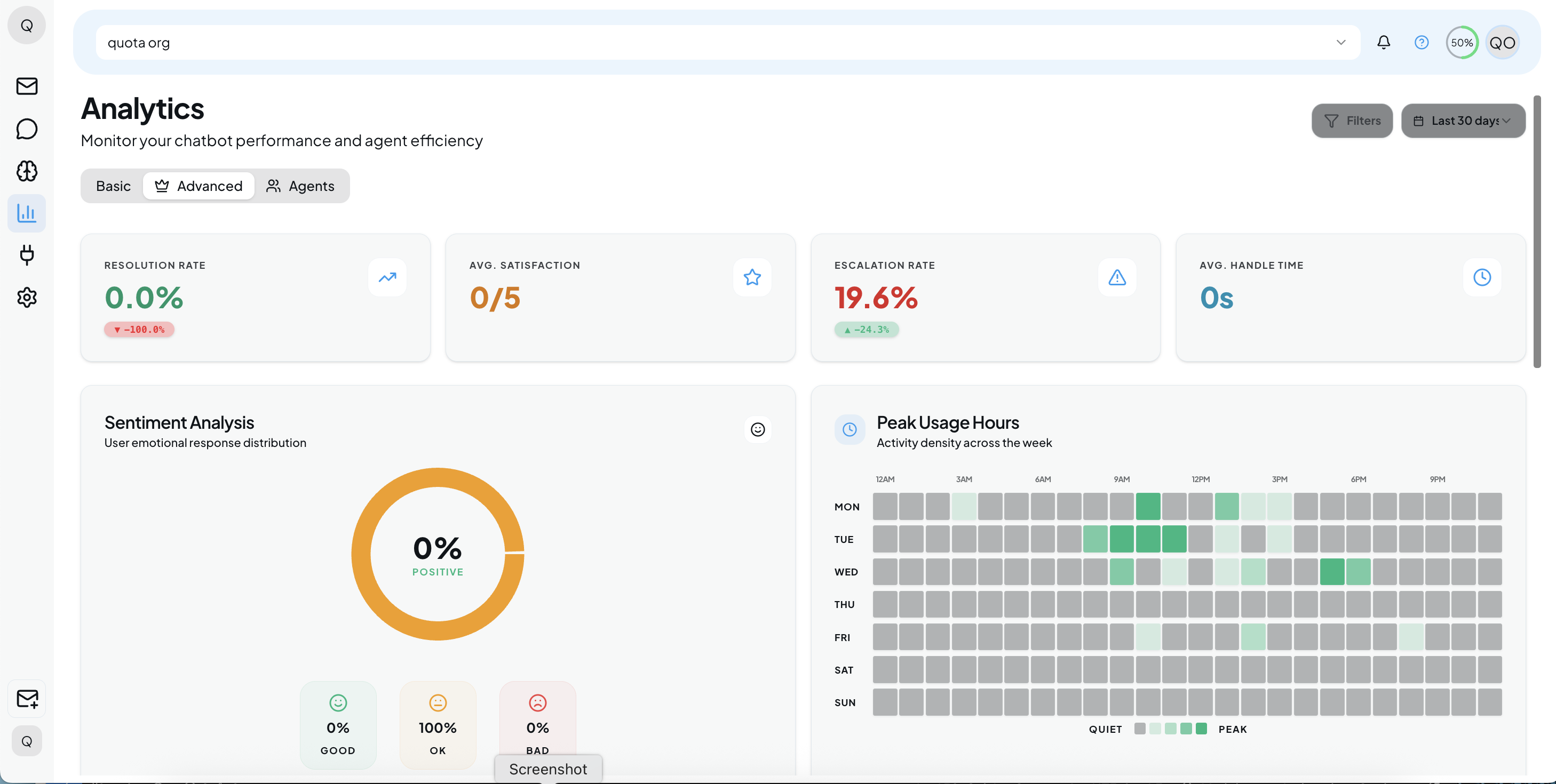
- Resolution Rate: The percentage of user inquiries that were successfully resolved by the chatbot without needing a human agent.
Goal: Aim for a higher percentage here to increase automation efficiency.
- Avg. Satisfaction: The average user satisfaction score (rated out of 5.0).
- Escalation Rate: The percentage of conversations that the bot failed to answer and had to pass on to a human agent (e.g., 22.2%).
Action: If this is high, check “AI Insights” to see why.
- Avg. Handle Time: The average duration of a conversation.
2. User Behavior & Sentiment
The middle section helps you understand user emotions and activity patterns.
Sentiment Analysis: A donut chart that visualizes the emotional response of your users. It categorizes conversations into Good, OK, and Bad. Use this to quickly gauge the overall mood of your customer base.
Peak Usage Hours: A heatmap grid that plots activity density across the days of the week (Mon–Sun) and hours of the day.
How to read it: Darker green squares indicate your busiest times. Use this data to schedule maintenance during quiet times or staff agents during peak hours.
3. Bot Performance Benchmarking
Located on the middle-left, this table allows you to compare different versions of your chatbots (e.g., “Tester Bot” vs. “Newly Created”).
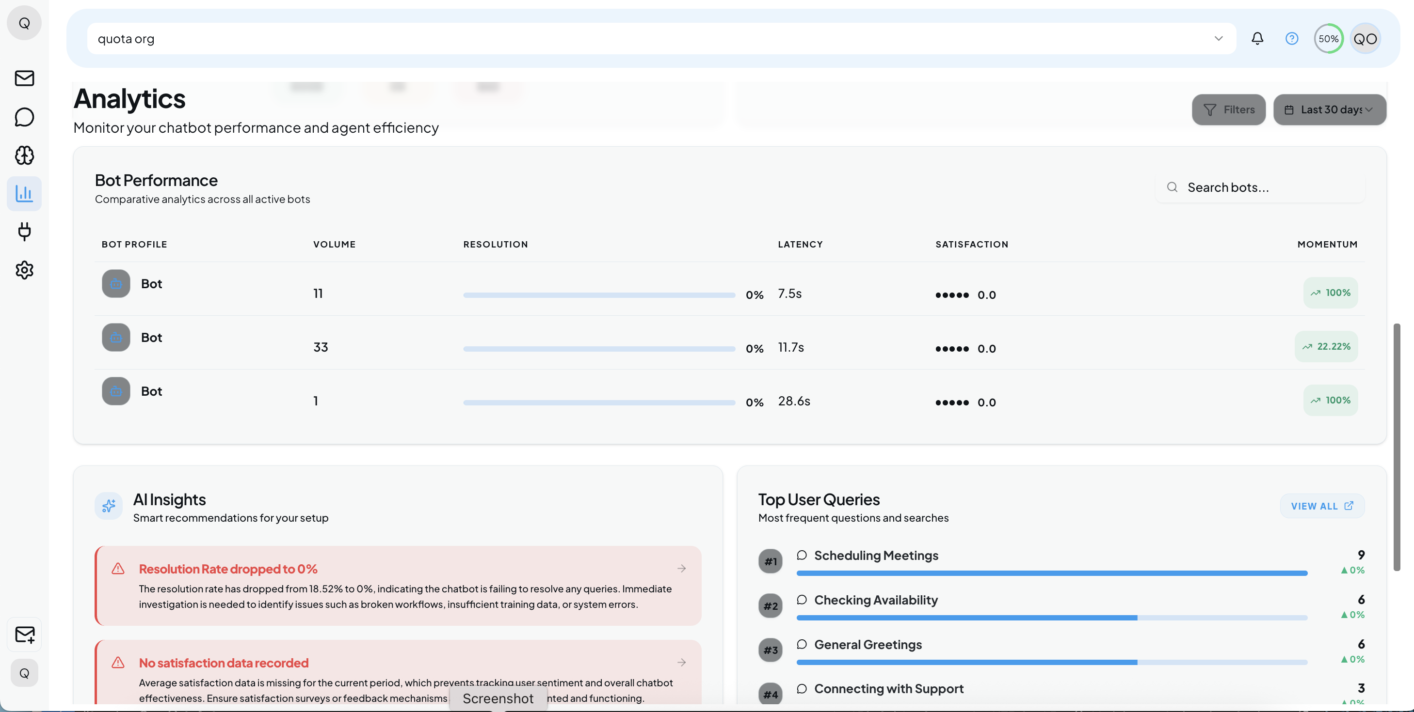
- Volume: The total number of sessions handled by the specific bot.
- Resolution: A visual progress bar showing the bot’s autonomy rate.
- Latency: Measures the speed of the bot. It shows the average response time in seconds (e.g., 16.3s) and the percentage change (e.g., 8.47%).
- Satisfaction: The specific star rating for that bot instance.
- Momentum: A trend indicator (e.g., 100% with an arrow) showing if the bot’s usage is accelerating.
4. Strategic Analysis (Deep Dive)
The bottom section provides actionable intelligence and specific user questions.
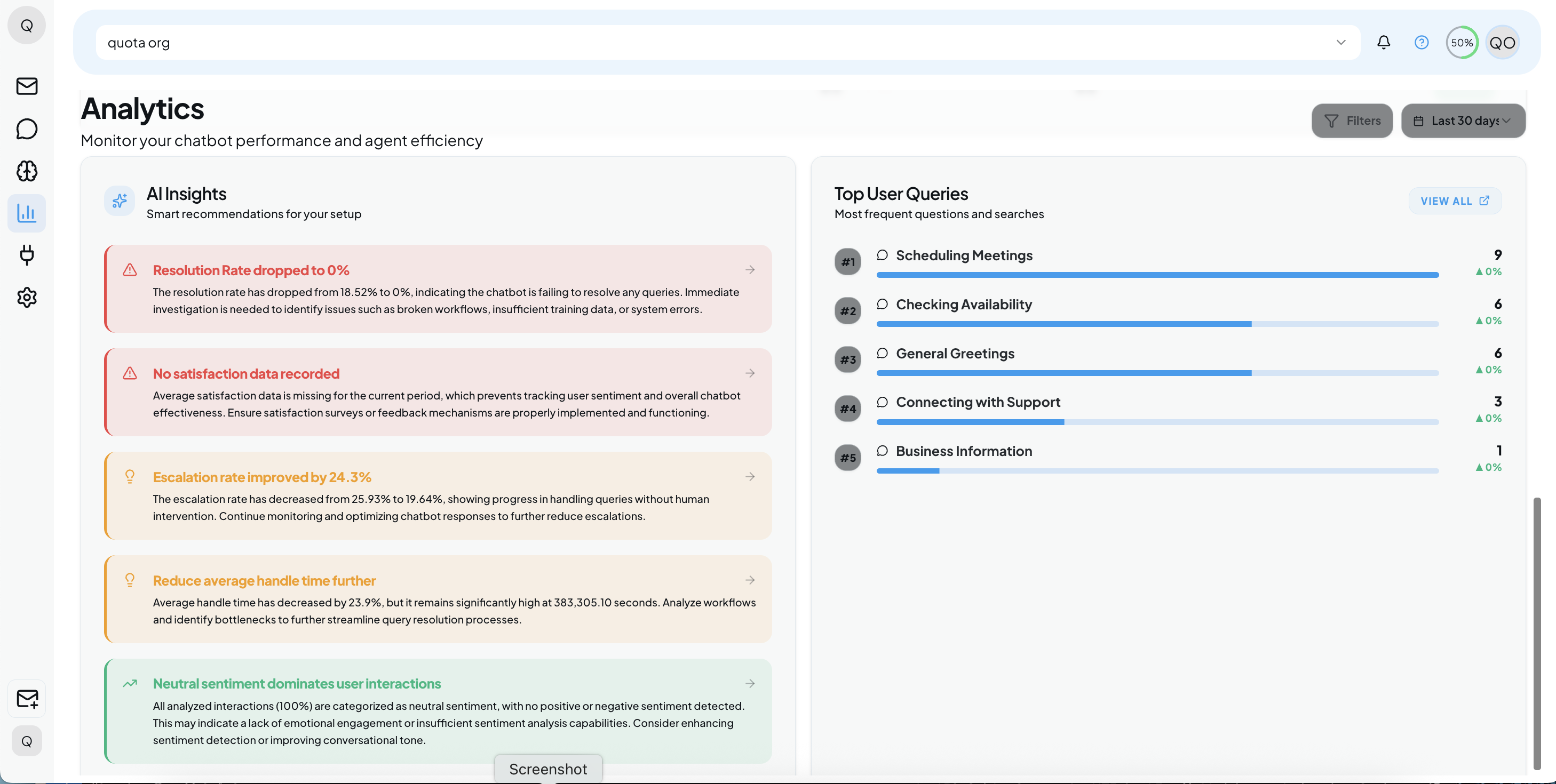
AI Insights
This intelligent widget analyzes your data to find problems and successes automatically.
- 🔴 Critical Attention (Red): Alerts you to urgent issues.
Example: “High escalation rate requires attention.” This means the bot is failing to answer too many questions.
- 🟠 Improvement (Orange): Suggestions to boost quality.
Example: “Improve user satisfaction score.” Suggests using feedback surveys to find pain points.
- 🟢 Positive Trends (Green): Highlights where your strategy is working.
Example: “Resolution rate shows significant improvement”.
- 🟡 Resource Allocation (Yellow): Timing advice.
Example: “Analyze peak usage hours,” suggesting when to allocate more server or human resources.
Top User Queries
A ranked list of the most frequent questions or phrases users are typing.
Usage: Use this list to prioritize new content. If “Scheduling Meetings” is your #2 query but your bot doesn’t have a scheduling feature, you know exactly what to build next.
Agent Analytics
The Agents tab is dedicated to managing your human support team. While the previous tabs focus on bots, this page helps you track how well your human agents are handling escalated conversations. Use this data to identify top performers, spot burnout risks, and ensure your team is meeting response targets.
1. Agent Team KPIs
At the top of the dashboard, you will find key performance indicators that summarize your support team’s current status and efficiency.
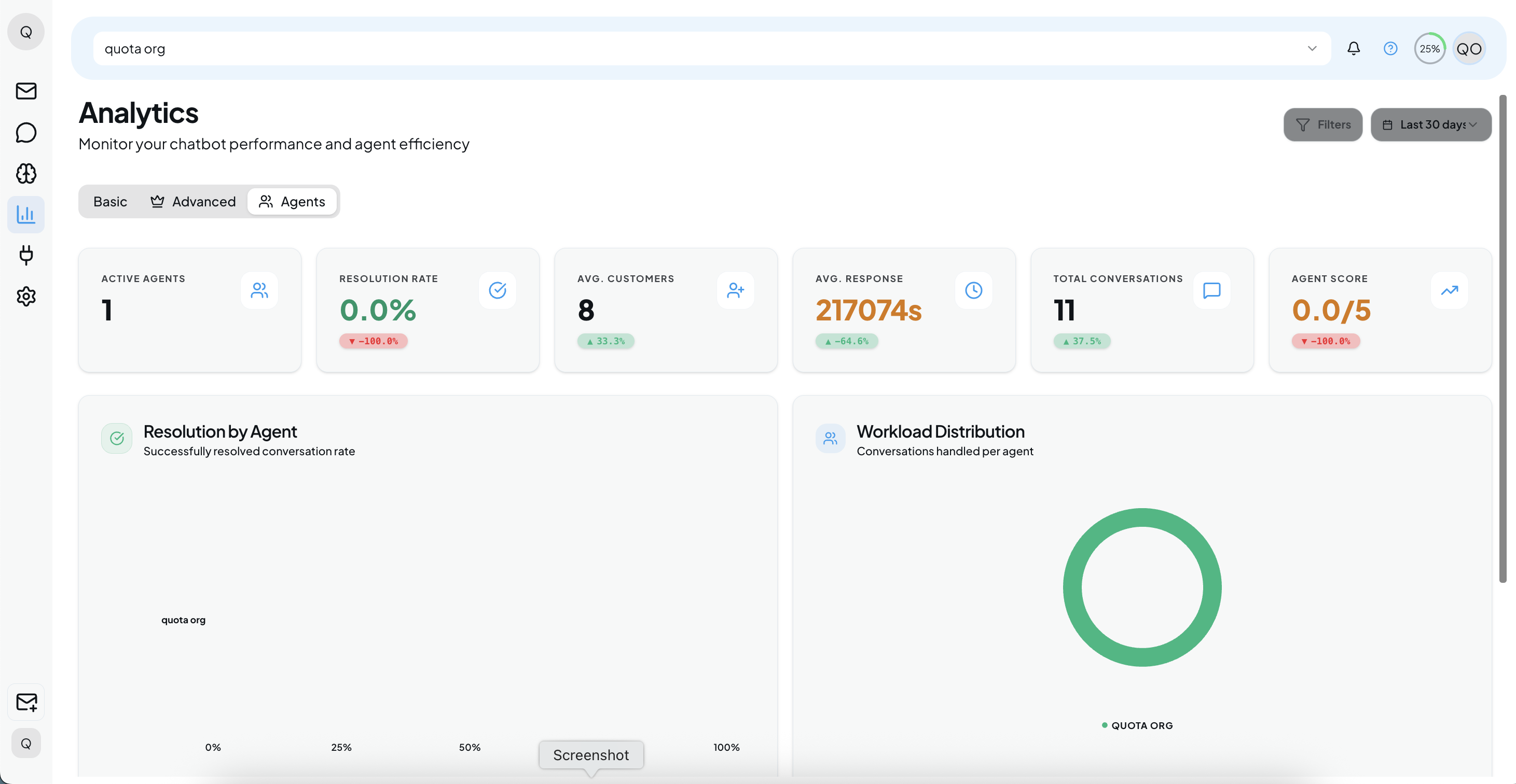
Why: This gives managers a quick “at-a-glance” view of team health.
- Active Agents: The number of support staff currently logged in and online.
- Resolution Rate: The percentage of conversations assigned to agents that were successfully resolved.
- Avg. Customers: The average number of customers currently assigned per agent.
- Avg. Response: The average time it takes for an agent to send a reply after a user message.
- Total Conversations: The total number of chats handled by humans during the selected period.
- Agent Score: An aggregate quality score (out of 5.0) for the entire team based on user feedback.
2. Workload & Capacity Visuals
The middle section contains visuals to help you balance the work across your team.
Why: These charts allow for quick visual comparison between team members.
- Resolution by Agent: A bar chart that compares the success rate of individual agents.
Usage: Use this to identify which agents are most effective at closing tickets.
- Workload Distribution: A donut chart showing the percentage of total conversations handled by each agent.
Usage: Watch this chart for imbalances. If one agent (one color section) takes up the majority of the chart, they may be overworked while others are idle.
3. Individual Agent Performance Table
Located at the bottom, this detailed list provides granular stats for every specific team member.
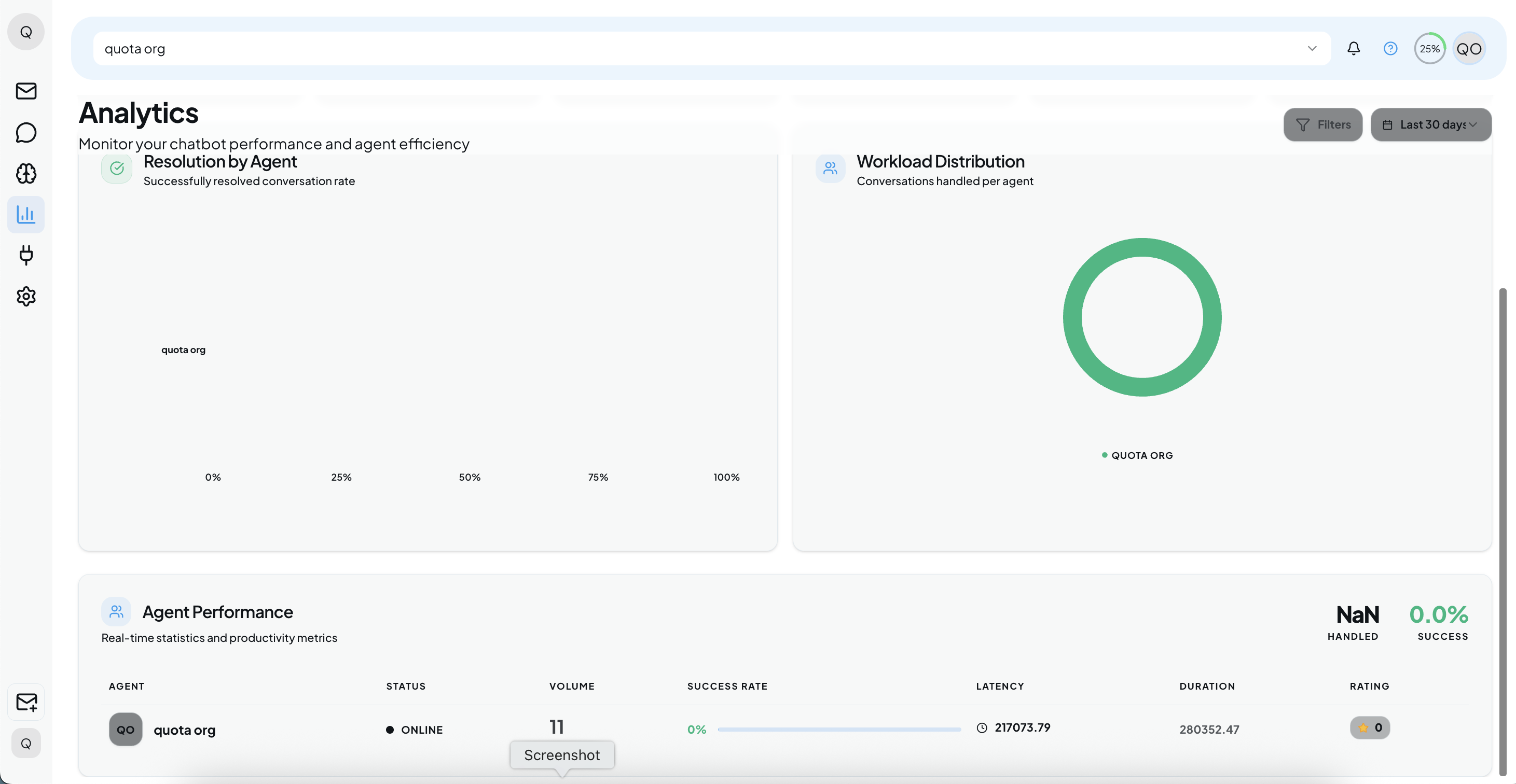
Why: This is the most detailed view for performance reviews.
- Agent Profile & Status: Displays the agent’s name and their current availability (e.g., Online vs Offline).
- Volume: The total number of chats assigned to this specific agent (e.g., 18).
Insight: High volume usually correlates with experience, but check the Success Rate to ensure quality isn’t dropping.
- Success Rate: The percentage of this agent’s chats that ended positively (e.g., 5.56%).
- Latency: The speed at which this specific agent responds to messages.
Goal: Keep this number low to ensure users aren’t waiting too long for a human reply.
- Rating: The specific star rating (out of 5) given by users who interacted with this agent.